EXAMPLES
We also thought it would be helpful to research examples of film posters as it will show us what again is displayed on the page, how they may create feelings or moods through pictures and colours and what sort of context is involved and how is it shown. I have particulaorly chosen posters that are and look similar to our genre.

This is a very effective poster as it has a lot of detail which is significant
to the film and will give the audience an insight about what the film is about.
The title
'NOTHING TO LOSE' is printed in a white sans serif
font which makes it clear and distinct from the poster and shows signs that the
poster is recent. It has included a review from the magazine 'GQ' which makes
the film poster sound more impressive. The actor on it is giving the audience
direct eye contact so they feel more directed and targeted by the film poster.

This is the poster from
'THE LOVELY BONES', which our short
film idea is based around. As you can see both of the main characters are shown
on the cover however the evil character, George is in a dark shadow which
symbolises his dark side and that he is trouble. Susie, the young girl who gets
killed is in the bright light with the sun shining behind her, signifing that
she is innocent and heavenly suggesting ideas that she might die in the film.
The location that the poster is shot in, or edited onto, is taken from the film
so all mise en scene flows. This makes the poster look professional and more
realistic. The word 'LOVELY' is edited in bold which can demonstrate the angelic
and kind side of the characters. Similarly, the white sans serif font portrays
the idea of purity which can be closely linked to Susie Salom.

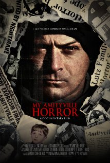
This poster of
'MY AMITYVILLE HORROR' is very effective as it
has miminal detail however it is very endearing and eye catching. The direct eye
contact from the actor allows the audience to feel more involved with the
film/poster and may give them a more meaningful insight to the moods and
feelings that the characters may feel in the film. The close up of the actors
face shows an unhappy expression which displays a sense of evil or foreboding in
the poster. The colour of the poster is very dull and dark which can reinforce
the evil side of the film however the picture of the little boy is in colour
which could evoke the idea of innocence and suggest that the film is something
to do with him. The newspaper pictures around the face of the actor could show
connotations on what there is to come in the film and they show key words such
as 'Lutz' 'Exorcism' 'Amityvile' 'Nightmare' and 'Horror' which are all of
similar ideas and meanings. The red font suggests the idea of blood
or danger which could also be closely related to the film.
______________________________________
When focusing on the first draft of my film poster, I have realised I am right
to focus much more on the female and male characters. However i have looked at
film posters, with mostly women on and i have realised that my female looks in
way too much peril, as she is a school girl in school uniform with tape over her
mouth; people could complain about this representation which is quite a
disturbing image when you look at it.
Below are some of the film posters I
have chosen
This poster of
'FUNNY GAMES' is very effective as the actress
on the cover is crying which shows distress and suggests ideas that the film is
set around drama/thriller however she is still very attractive which
will attract the target audience, males, as they would like to watch a film with
actractive actresses in it. Her expression portrays the idea that she is in fear
of something as her mouth is dropped and her lips are dry which could convey
ideas that shes cold or out of breath. Her eye is very focused which could mean
there is something she's in fear of and has to watch at all times to remain
safe. Her hair is over one eye, showing to be quite messy which could suggest
she has been running or is in a bad situation where she has not time to worry
about her hair. There is miminal writing on the poster - the title is in
captials in a white sans serif font which stands out against the background and
suggests that there is a sense of inocence behind it. There is a text box
containing information about the film which is in a small print as no-one really
pays attention to this information and it isn't as important.

This poster for '
GOTHIKA' is effective because the actress
looks trapped as she has her hands against glass. She has direct eye contact
with the camera which would make the audience engage with her character more and
make them feel vulnerable. The direct eye contact portrays the message of
'help' as you can see pain/fear and sympathy in her eyes asking to be let out.
The poster has been edited blue which could suggest ideas that the surroundings
she is in are cold, similarly there are rain drops on the glass which conveys
ideas that she is outside or looking outside, wanting to go out.There is much
more text on this poster which gives it substance and looks more informative
than others. I feel this makes the readers feel more knowledgeable about the
film. The title is in a sans serif font however looks spoody and scratched or
craved on to something; this suggests negative connotations like frightfulness
and fear. Similarly, the same font seems to be engraved onto her forearm. It
says 'not alone' which also gives the audience an insight for what to come

This poster of '
CHLOE' is again very effective as they've made
the actress look empowering due to the direct mode of address - using eye
contact, allowing her to personally target the audience and make them feel on
edge. As she is sightly looking up, it suggests a sense of evil or mystery as
she looks like shes in control. She is very attractve which draws attention to
the poster and her big eyes are very endearing which captures people attention.
The other actor and actress are edited on behind her conoting that their roles
aren't as important in the film or that they are less powerful. The title
'CHLOE' is a females name which suggests that this could be the name of the
blonde actress conveying ideas that the film is based around her. The images in
the poster are of strobe lights and cars along a lit up street which suggests a
high life profile and a lot of money is involved which sets the scene
This poster of '
SCREAM' is very capturing due to the close up
of the actresses face which makes the audience feel more involved and engaged
into her emotions. Her hand is over her mouth as if shes seen something
frightening and her eyes are wide which supports this idea. Easily, you can see
that she is scared and distressed at what she has just seen.with her eyes wide
as well. She is a very attractive female and still looks pretty even with the
situation she is in. The title is set out with spaces in between each letter
which could signify a long period of pain or distress. It is printed in a white,
sans serif font which is also in captials which could suggest that the title is
being shouted or there for a dramatic effect. The letter 'M' has been edited
different compared to the other letters which could portray ideas that is
something intriging or different about the film. There is a lot of text at the
bottomof the poste, which is again printed in a small font as they are details
that aren't that important.

This poster of
'the silence of the lambs' is an effective
poster due to the close up of the clear skin, beautiful face. The deep brown
eyes are very intriging and draw the attention of the audience. The clear,
flawless skin shows purity and innocence. The mouth is covered by a moth with
contradicts the title as it suggests that 'lambs' are invovled. This would make
the audience question what the film is about and in turn, will watch it to find
out. The title in all in low case sans serif font which suggets it is quite a
laid back film and the colour 'oragne' makes it seem quite warm and
friendly. Just like other posters, there is small font at the bottom
containing information which isn't that important.
This poster of
'THE SEASONING HOUSE' is very effective due to
the actress which is on the cover. As she is young, it makes the audience feel
vulnerable for the actress and the look of misery and despair enhances this
idea.When taking my short film into consideration and my genre, this would be
the closest to my idea due to the age and genre to my short film due to the
young actress and the mood it portrays. This poster is hard to read as the
actress looks distressed and vulnerable, however she is holding a knife which
could suggest she is the one thats in control of it. The direct eye contact
emphasises this idea as it makes the audience/viewers feel on edge and
uncomfortable looking at it. The actress is also holding a teddy bear which
reinforces her age. The editing of the poster seems to have a 'sepia' tinge to
it, which conveys the idea of an old/dated setting. The serif font also supports
this idea as it is an old style of font and matching this with the theme of the
film will help to show the mood and feeling it is trying to create.

This poster of '
WAZ' is very effective as there is a closer up
on the persons face, mainly focusing on the eye which shows the idea of evil.
The shot clearly shows the expression on their face which looks smug which could
portray ideas they have achieved something - maybe revenge? This idea is
reinforced by the blood which is on their face which could suggest drama and
gory element will occur; this also conveys the idea that they are in control. I
am unsure if the person is male or female in the picture which could also create
mystery as it makes me want to find out more. The title is in a red sans serif
font which could resemble blood or hatred which fits in nicely with the picture
and the mood it portrays


